Planning a wedding is an exhilarating journey, filled with decisions that reflect who you are as a couple. Among these choices, the color of your wedding invitations holds a unique significance. It is not just about aesthetics but about creating a first impression that symbolizes your forthcoming union.
The right color can capture the essence of your wedding theme or highlight a cherished symbolism. But with an infinite spectrum of shades to explore, finding the perfect match might feel overwhelming. Whether you lean towards timeless elegance or a splash of modernity, understanding the role of colors in setting the mood for your big day is key.
- Importance of Invitation Colors
- Traditional Color Choices
- Modern and Trendy Shades
- Symbolism Behind Colors
- Tips for Matching Themes
Importance of Invitation Colors
The color of your wedding invitations is often the very first detail guests encounter about your wedding. It acts like a prelude to the celebration that awaits, hinting at the mood, style, and setting they've been invited to be a part of. This is why, rather than being an afterthought, the choice of color for these tiny pieces of paper is as significant as the vows themselves. Imagine sending a creamy ivory invitation adorned with delicate gold accents; it’s not just a piece of stationery, but a promise of elegance and sophistication, perhaps hinting at a classic ballroom reception.
Choosing the right color also involves considering the symbolism that particular hues may hold. Colors can evoke emotions and convey subtle messages. For instance, blue might inspire feelings of tranquility and peace, while red could symbolize love, passion, or even cultural significance in certain traditions. A playful pink might suggest a joyous and lighter theme, evoking thoughts of springtime blooms. The invitation's shade, therefore, carries with it an unspoken message, setting guests’ expectations long before they find their seats. According to Veronica Foster, a renowned wedding planner, “The invitation color is your canvas; it paints the first picture of the day your guests won’t forget.”
This choice isn’t merely an aesthetic decision; it relates to personal expression as well. It allows couples to weave in their shared history or cherished memories. Maybe a couple ties the bond over a shared moment during sunset, capturing that heartfelt hue in their invitations. Or perhaps, they went on many adventures together by the ocean's blue, choosing a palette reminiscent of sea foam and sand. Couples find that sharing these pieces of their story can add an intimate layer to their special day, making it meaningful for every attendee.
Furthermore, the right hue can play an essential role in theme consistency. Everything from venues to bridal attire can coordinate with the chosen scheme. When the invites align seamlessly with napkins, floral arrangements, or even the cake design, it hints at careful planning and a harmonious theme. It provides a coherent visual experience, ensuring your big day isn’t just memorable for its highlights but for its cohesive beauty. Many modern brides and grooms opt to match their invitations not just to the venue decor, but sometimes the season or even significant personal dates.
Finally, it is worth considering how colors look across various printing methods. Rural weddings might favor natural textures and earthy tones, while urban events might include sleek metallics in their design. Offset printing and letterpress can yield different results, potentially bringing out undertones in colors unseen in digital renderings. Therefore, reviewing test prints is essential to achieving the perfect color match. By investing thought into the selection process, you truly ensure that each guest receives a piece of your vision, one that they carry into the excitement of your wedding day.
Traditional Color Choices
When it comes to wedding invitations, traditional colors have long held a special place in the hearts of many couples. These colors, often characterized by their timeless appeal and understated elegance, offer a sense of familiarity and nostalgia. Classic choices like ivory, cream, and white lead the way. These hues symbolize purity and simplicity, often reflecting the innocence and fresh start that marriage brings. While some may deem them safe, these shades provide a beautiful, blank canvas that elegantly frames intricate embossing, decorative motifs, or delicate embellishments.
Deeply rooted in history, gold and silver have been associated with opulence and celebration across cultures. Rich gold accents can add a touch of royalty, reminiscent of grand celebrations in past eras where gilded trims and luxurious fabrics were the order of the day. On the other hand, silver exudes a cool, understated elegance that complements almost any theme. It often signals formality and sophistication, perfect for an evening wedding steeped in tradition. A fascinating aspect of these precious metallics is how they reflect light, adding an interactive dimension to stationary that catches and plays with one's gaze.
"Nothing says heritage and tradition quite like the subtle shimmer of gold and silver on an invitation," suggests renowned wedding planner, Alice Martin.
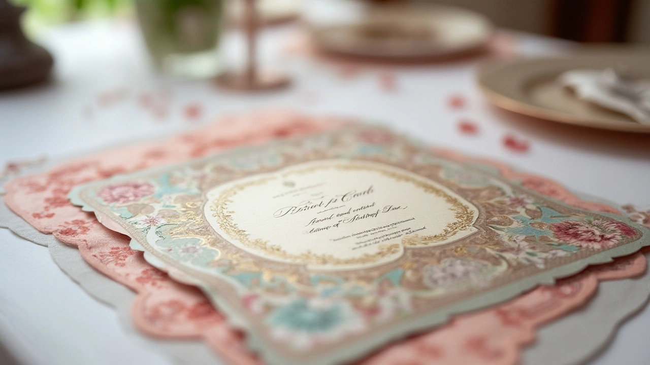
Blush and soft pastels also rank high among traditional choices, offering a gentle, romantic vibe that speaks volumes about tenderness and sensitivity. These delicate hues are often seen as bridging the gap between modern twists and age-old elegance. This balance makes them a favorite choice for many brides who wish to evoke a sense of calm and serenity, setting subtle undertones for their nuptials. Such colors also work well year-round, transcending seasonal boundaries to offer year-long appeal.
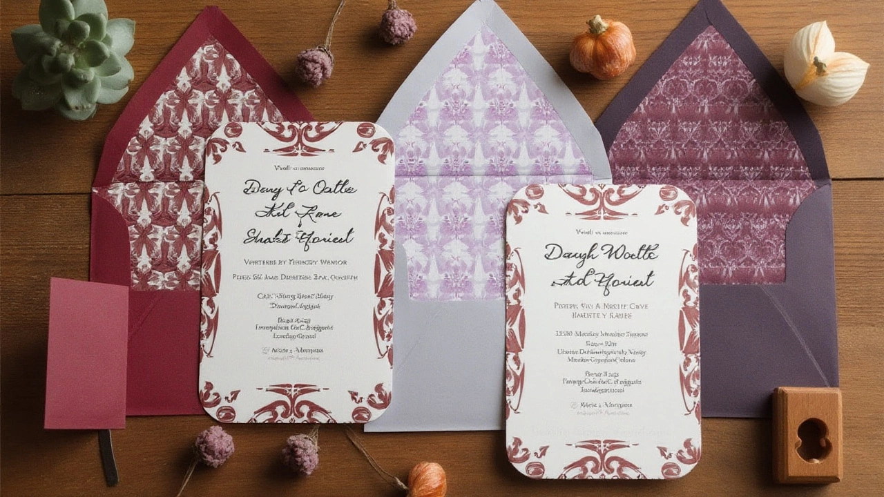
Let's not forget the regal allure of dark hues. Navy and burgundy are reminiscent of grand house parties and lavish balls. While not as light as other traditional choices, their depth adds a dimension of prestige and gravity. Particularly for winter or evening weddings, these colors provide warmth and intensity. The use of traditional darker shades like navy can denote trust and dependability, qualities that couples, no doubt, hope their guests perceive in their upcoming union.
| Color | Symbolism | Season |
|---|---|---|
| Ivory/Cream | Purity, new beginnings | Year-round |
| Gold | Opulence, luxury | Fall/Winter |
| Blush | Romance, tenderness | Spring/Summer |
| Navy | Trust, prestige | Winter |
These invitation colors do much more than merely beautify; they communicate a story even before the day arrives. Engaging with such traditional colors can bring together elements of personal heritage, shared culture, and familial blessings, wrapping them neatly within the envelope of cherished invitations. It's fascinating how, through a simple choice of hue, you can weave a rich tapestry of history and emotion, setting the stage for what promises to be an unforgettable celebration.

Modern and Trendy Shades
In the vivid tapestry of wedding planning, wedding invitations often act as a canvas to express modern aesthetics and trends. This season, couples are straying from the conventional paths to embrace hues that symbolize their fresh perspectives and individuality. The charm of these contemporary shades lies in their ability to elevate a simple piece of paper into a statement of personality and style. Among the popular choices are subtle nuances like dusty rose, a color that offers a muted blend of pink and beige, exuding sophistication and romance without overpowering the senses.
Equally alluring is sage green, a shade that finds its place in the heart of many modern weddings. It resonates with the growing inclination towards eco-friendly themes. This calming color not only unfolds a visual narrative of tranquility but also complements a wide array of motifs, from rustic farmhouse to elegant garden vistas. Meanwhile, deeper tones like navy blue have also marked their presence as timeless and versatile, suitable for both formal urban settings and serene coastal venues. This color elegantly contrasts with metallic gold or crisp white, creating an inviting look.
Amidst these choices, some couples gravitate towards bolder options. Terracotta, for instance, epitomizes warmth and earthiness, providing the perfect backdrop for invites that suggest a cozy, intimate celebration in autumnal surroundings. Another contemporary favorite is marigold, a vibrant and cheerful hue that captures the joy and optimism of a couple embarking on a new journey. According to a recent survey by the Wedding Colors Institute, about 35% of invitations from the latest wedding seasons featured at least one non-traditional color, showcasing the shift towards individual expression.
"The trends in wedding invitation colors reflect a broader cultural shift towards personalization and the breakdown of traditional norms," notes Emily Johnson, editor of Bridal Mag. "Couples today want their personalities to shine through every element of their celebration, and that often starts with the colors they choose to represent their day."
As you navigate this colorful adventure, it is essential to consider your venue and season, ensuring your choice aligns with the natural palette around you. Whether it's the refreshing blush of spring or the rich aubergine of winter, selecting shades that resonate with both the backdrop and your personal taste can set a cohesive tone. Experimenting with color combinations allows for striking results; a pairing like slate gray with peach can capture the delicate whispers of romance, perfect for those who love nuances in expression. The joy lies in embracing these modern and trendy shades, ensuring your wedding invitations are not just seen, but truly remembered.
Symbolism Behind Colors
Choosing the color of your wedding invitations is not simply about matching your favorite hue with the decor. Each color holds a story, a symbolic meaning that many cultures and traditions have revered throughout history. Understanding these meanings can add a deeper layer to your wedding's narrative. For instance, white is widely regarded as the color of purity and innocence, which symbolizes new beginnings and a clean slate. It's a favorite for many couples who want to convey simplicity and tradition, thus often chosen by those who prefer a classic theme.
On the opposite side of the spectrum, red is a color that summons passion, vitality, and excitement. It’s not uncommon in cultures such as Chinese weddings, where red signifies joy and love. This makes it an ideal choice for couples looking to infuse their invitations with energy and warmth. Equally compelling, blue speaks of tranquility, stability, and trust. It has long been associated with calmness and reliability, appealing to those who wish to bring a peaceful and harmonious aura to their special day.
"Colors, like features, follow the changes of the emotions," said Pablo Picasso, recognizing the profound connection between color and its emotional impact.
Green is another intriguing option, representing renewal, growth, and harmony with nature. It’s perfect for eco-conscious couples or those opting for a rustic, outdoor setting. Its ties to fertility also make it a fitting choice for couples wishing to symbolize growth and prosperity. Yellow, often associated with happiness, intellect, and energy, can reflect a sunny, cheerful ambiance. It’s a great choice for daytime weddings that thrive on vibrant, lighthearted energy.
Lastly, black, while unconventional, has become increasingly popular for its sophistication and timeless elegance. It's the color of power and formality, offering a stark yet stunning backdrop that can make any invitation stand out. Gold and silver, while not colors in the traditional sense, exude luxury and grandeur, instantly elevating the tone to one of opulence and celebration. When considering these choices, integrating your personality and the essence you wish to share makes your invitations truly unique.
Each hue can tell a story, reflecting both a personal and emotional journey. When crafting a cohesive invitation design, remember these symbolic meanings as they offer a glimpse into the journey you are about to embark on together. This can create a heartfelt connection not only between you and your guests but also between the visual elements and the story of your love.

Tips for Matching Themes
When it comes to selecting the right color for your wedding invitations, it's all about tying together the overall aesthetic of your event. The colors you choose should be a reflection of both your personalities and the ambiance you wish to create for your guests. Start by identifying the central theme of your wedding. Is it a vintage garden party, a chic city affair, or a casual beach ceremony? Each theme offers a unique palette of colors, and your invitations should mirror those tones. By doing so, you not only set the mood but also give your guests a hint of the beautiful experience that awaits them.
To effectively match the theme, it's incredibly useful to consider the season in which your wedding takes place. Seasonal colors can often offer the perfect backdrop for your invitation hues. For instance, spring weddings might embrace pastels and soft hues, summer calls for vibrant, lively shades, autumn often showcases earthy, warm tones, while winter is perfect for rich, deep colors. These choices not only align with natural surroundings but also help create a visual cohesion that feels both intentional and harmonious.
In the renowned words of wedding planner Collette Thompson, "The color palette should not only complement the season but also tell your unique story as a couple."
Coordinate with Venue Décor
Another key tip is to coordinate your invitation colors with the venue's existing décor. If the venue has a distinct color scheme or architectural style, incorporating those elements into your invitation design can ensure a seamless transition from invitation to the big day itself. For example, if you're getting married in a rustic barn with lots of wooden hues, consider invitations with earthy tones, perhaps with a splash of greenery or burgundy to complement the natural wood.
Personal Touches and Cultural Significance
Incorporate personal elements that have significance to you both, whether they're colors that have special meaning in your relationship or shades that honor your cultural background. Many cultures have specific color associations—for instance, in Chinese culture, red is a symbol of joy and luck, while in Western weddings, whites and ivories symbolize purity and new beginnings. Balancing personal significance with aesthetic appeal can add depth and personality to your invitations, making them truly memorable.
Playing with Textures and Finishes
Experimenting with textures and finishes can also help your invitations stand out. Embossed lettering, satin ribbons, or metallic foiling in coordinating colors can elevate your invitations from a simple piece of paper to a work of art. Use these elements sparingly, and let the main color palette be the central focus. A blend of tactile elements can provide an additional layer of connection to your chosen theme, inviting guests to touch and feel a hint of your wedding ambiance even before they arrive.
At the end of the day, the secret to matching your invitations to your wedding theme lies in small, thoughtful details. With the right color choices and attention to theme coordination, you can create invitations that not only inform and invite but also excite and enthrall your guests from the very first glance.
