Choosing the right colors for your wedding decorations can be one of the most exciting yet daunting tasks in the planning process. The hues you select tie the entire celebration together, creating the atmosphere that sets the mood for your special day. In a kaleidoscope of possibilities, reflecting on what each color conveys can transform your venue into a captivating scene.
Understanding the significance of each color can help you align your choices with the emotion you wish to convey. Whether it's the romantic classicism of blush pink or the gentle serenity of sage green, each choice plays a pivotal role. Let’s embark on this colorful journey together, exploring tips and ideas for selecting the perfect shades to enchant your guests and leave a lasting impression.
- Popular Wedding Colors
- Seasonal Color Themes
- Personal Style and Preference
- Tips for Color Coordination
Popular Wedding Colors
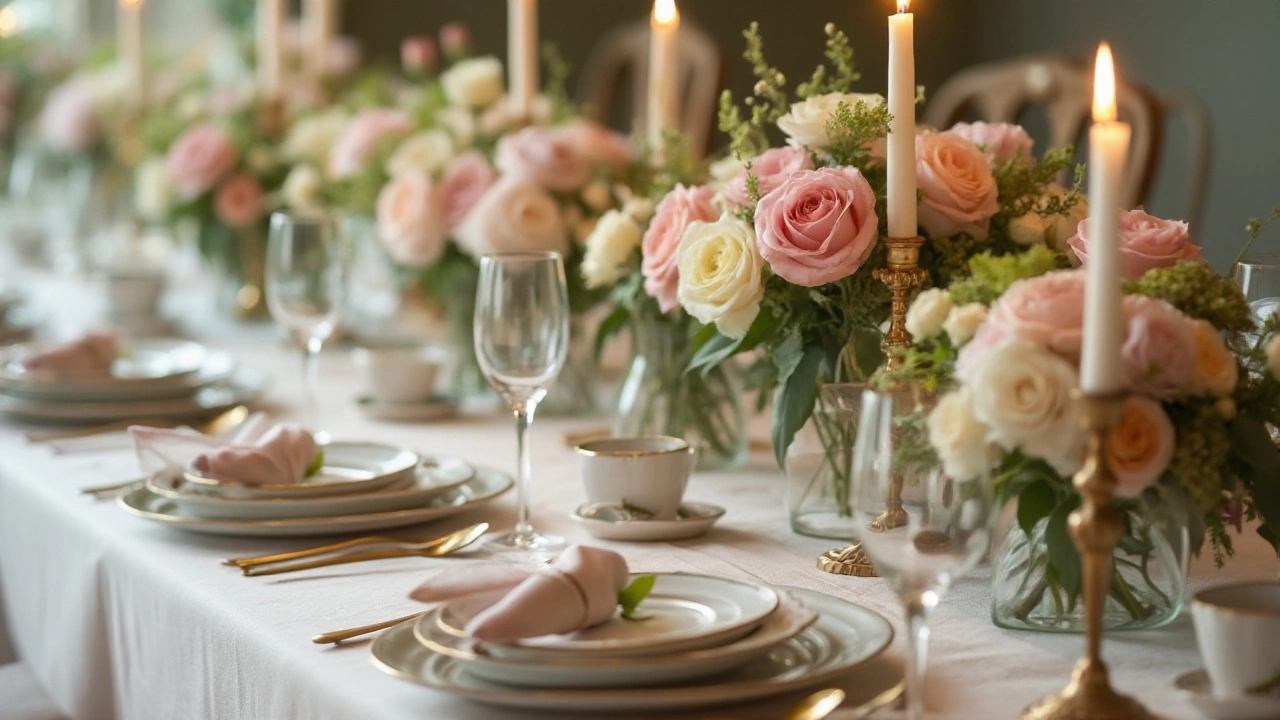
When it comes to selecting wedding colors, trends often shift like the seasons, yet some hues remain timelessly fascinating. Among the most beloved choices, blush pink holds an enduring allure, often seen in romantic settings where the ambiance whispers softness and sophistication. This rosy hue pairs seamlessly with metallic accents like gold or silver to create an enchanting aura. A quintessential favorite, it becomes even more radiant under the warm golden sun of a spring or summer ceremony.
A newer addition to the spectrum of beloved wedding colors is greenery. This fresh and earthy tone speaks to a return to nature, echoing sustainability themes that have become more prominent in recent years. Pantone, the authority on color, aptly crowned "Greenery" as the Color of the Year in 2017, a decision reflecting an increasing desire to reconnect and rejuvenate. Adding sage or olive makes for a charming overlay, fostering a theme of tranquility and balance. Beyond aesthetics, these hues are often linked to growth and harmony, especially appealing to couples seeking a union grounded in peace.
Classic navy offers a bold, yet refined, choice that has fascinated couples for decades. Its deep and rich undertone acts as a versatile background, particularly suited for formal weddings or nautical themes. Navy's versatility is such that it harmonizes beautifully with almost any color, making it a splendid companion to coral, blush, or even gold. This adaptability allows for creativity and personal flair in decoration without leaving the elegance associated with a more traditional approach.
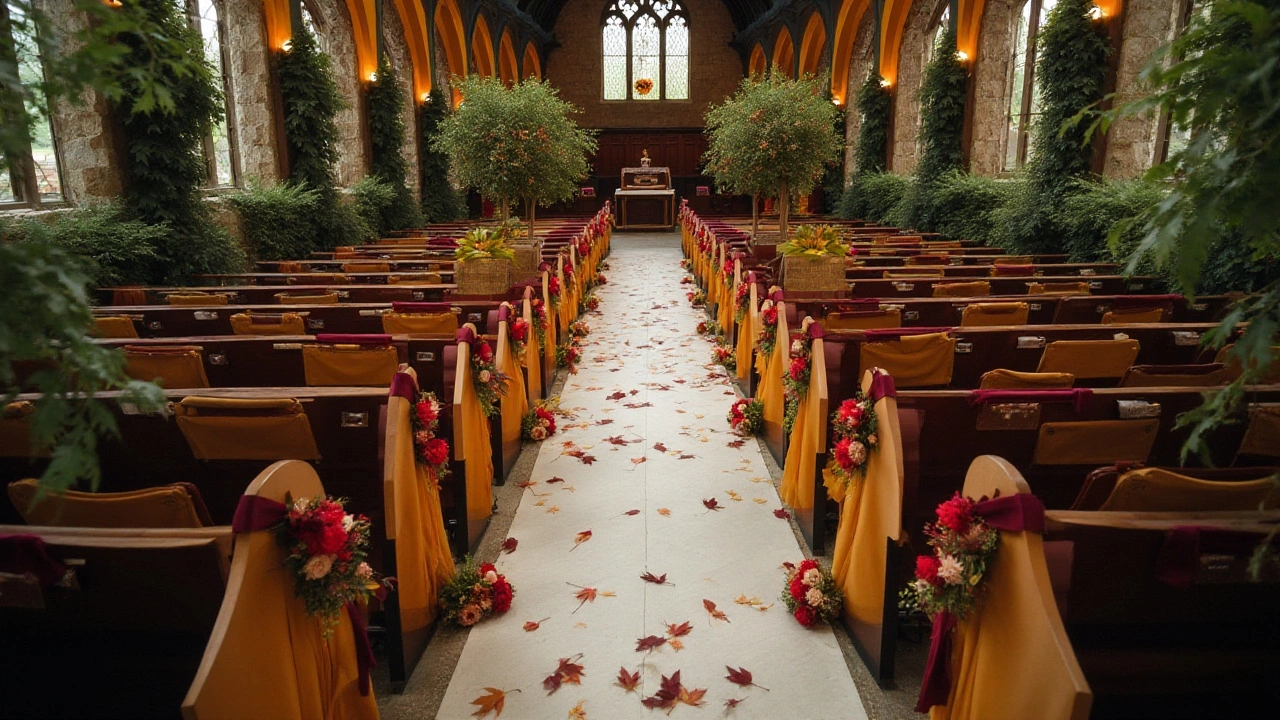
For those who hold a penchant for boldness, the resurgence of jewel tones presents an enticing palette. Rich colors such as burgundy, emerald, and sapphire create a dramatic and opulent atmosphere. These colors, reminiscent of royal opulence, often appear in fall or winter weddings, their deep, lush appearances perfect for the cooler, darker days. A vivid bouquet of these hues against an ivory backdrop can offer a striking composition that guests are sure to remember.
Finally, the minimalist approaches often favor soft, neutral hues like ivory, taupe, or even greige. These understated colors emphasize elegance and simplicity, suitable for minimalist couples who prefer subtleties over ornate embellishments. These palettes often shine with the right lighting setups, creating a serene and modern esthetic that complements a wide array of settings, from the chic city loft to a quaint countryside barn.
With each color choice carrying its meaning and vibe, it's easy to see how selecting the best wedding hues can be both a journey in style and a way to mirror your story. As you ponder these popular choices, remember what Heather Greene, a noted wedding designer, once remarked:
"The hues chosen will not only set the scene for your day but will forever tint the memories of every attendee."

Seasonal Color Themes
Choosing a wedding color palette that aligns with the season not only captures the essence of the natural surroundings but also ensures a cohesive look across various elements of the celebration. Each season offers unique inspirations, so embracing the hues of nature can enhance the ambiance of your wedding. During spring, colors often reflect the blossoming flowers and fresh renewal of the world. Soft pastels such as blush pink, lavender, and mint green are popular choices, creating a subtle and romantic vibe. These gentle colors also work beautifully with gold or silver accents, adding a touch of elegance without overwhelming the delicate theme.
As the heat of summer ushers in, the colors tend to become more vibrant and bold, reflecting the sunny, energetic atmosphere. Popular options include tropical tones like vivid teal, bright coral, and sunny yellow. These colors can be paired with neutrals to balance their energy and create harmony. Such bold hues deliver a vibrant and lively atmosphere, which is perfect for outdoor weddings. Floral arrangements often play a significant role in tying these themes together, offering a burst of color and a fragrant backdrop.
Autumn, rich with jewel tones and earthy shades, inspires wedding decorations that capture the crisp, cozy feel of the season. Deep burgundy, burnt orange, and forest green accentuate the natural beauty of this time of year. Pairing these hues with rustic elements like wood and burlap enhances the warm, inviting feel of an autumn wedding.
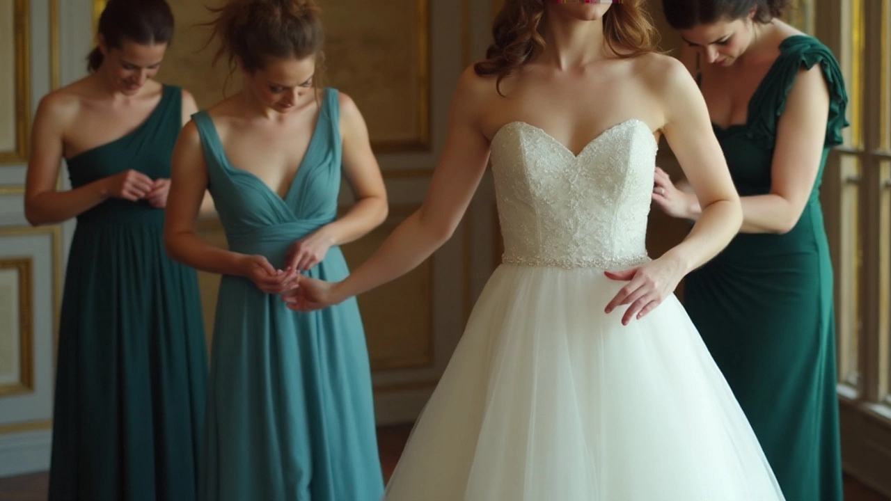
"The natural hues of autumn create a perfect palette for those seeking a rich and inviting celebration," says renowned wedding designer Sarah Johnson.Such colors can be beautifully incorporated into all aspects from table settings to bridesmaid dresses, ensuring the theme is cohesive and enchanting.
The wintry months call for a more sophisticated approach, often incorporating icy blues, shimmering silvers, and rich plums or deep reds. These colors evoke a sense of winter wonderment and can be enhanced by candlelight or twinkle lights for a magical evening vibe. A common trend for winter weddings is to incorporate metallics, either as part of the color palette or as complementary accents. Whether you choose a snowy white theme with hints of silver or a more bold approach with wedding colors like deep emerald and gold, each choice encapsulates the serenity and sophistication of winter. Incorporating textures like velvet or silk can also add depth and luxury to the decorations.
Aligning your chosen colors with the natural rhythms of the seasons not only enhances the visual appeal of your celebration but can also contribute to more sustainable choices, like using seasonal flowers and natural fabrics. This thoughtful approach ensures your wedding feels not only beautifully orchestrated but also in sync with the world, creating a day full of warmth and splendor.

Personal Style and Preference
When it comes to planning a wedding, your personal style and preference are the guiding lights that can turn an ordinary event into a deeply meaningful celebration. Colors are powerful conveyors of mood and emotion, and choosing them thoughtfully can reflect your personality as a couple while also setting a distinct ambiance. Whether you lean towards bold and vibrant hues or the understated elegance of muted tones, tapping into your personal taste can create a captivating harmony that resonates throughout your wedding day.
From classic to contemporary tones, the choices are as varied as personalities themselves. Many brides and grooms find inspiration in their personal experiences and shared interests. For instance, if you both love the beach, a palette of seafoam greens, sandy beiges, and gentle blues can evoke memories of coastal adventures. Others might derive their color theme from cherished family traditions, opting for hues that are historically significant or culturally relevant. This link to personal connections can infuse the day with a sense of continuity and embrace the essence of who you are together.
Indeed, one cannot ignore the influence of the latest trends in wedding colors. However, weaving your personal preference with tasteful nods to current trends can ensure your wedding feels timeless, not dated. For example, the recent resurgence of ’70s inspired palettes might tempt you to integrate earth tones such as warm terracotta and ochre, which can mix beautifully with more modern metallics like rose gold or copper. This blend of old and new can reflect a balance between honoring past trends and creating your present-day statement. In the words of wedding planner extraordinaire, David Tutera,
“Your wedding should be a reflection of who you are as individuals, as well as who you are together.”
Another essential aspect to consider is the venue. The existing colors and features in your chosen location can either enhance or clash with your selected hues. For effective coordination, it is crucial to envision your preferred color schemes in the actual setting. A rustic barn wedding may blend seamlessly with nature-inspired greens and earth tones, while a sophisticated ballroom might call for elegant jewel tones or classic black and white. Being flexible with your options and considering the setting ensures your chosen colors complement the space, creating an aesthetically pleasing harmony.
To assist in narrowing down your options, many couples find it helpful to create mood boards. A physical or digital collection of images, textiles, and color swatches can help you visualize how different elements work together. Start by picking a base color that resonates strongly with you both and then consider complementary shades that can add depth and contrast. With the wide array of tools available online, like Pinterest or Canva, designing your unique color story has never been easier. This approach not only aids in decision-making but can also serve as a reference for vendors and planners, streamlining communication and ensuring everyone is on the same page.
For those who appreciate data, a survey by The Knot found that nearly 62% of couples opt for a neutral palette and tend to incorporate subtle accent colors. This statistic reinforces the idea that while trends play a pivotal role, personal choices still largely dictate wedding themes because they are what ultimately make a day uniquely yours. Whether it’s an unexpected pop of color hidden in a bouquet or a bold feature piece like a colorful altar backdrop, using colors to tell your love story makes for memorable moments that guests will cherish.

Tips for Color Coordination
Color coordination is the art of balancing hues to achieve a visually appealing design, especially in wedding decorations where every shade contributes to the magic of the moment. To start with, selecting a primary and secondary color is crucial. The primary shade serves as the anchor, while the secondary can be used in details like flowers, napkins, or even the cake. It's often recommended to have a neutral or metallic tone as a base, providing a canvas where brighter colors can stand out without overwhelming the scene. Consider the venues’ natural tones as well, keeping the bigger picture in mind when selecting drapery or floral arrangements.
Don't be afraid to experiment with textures and patterns. Combining smooth silks with rustic burlap or glossy surfaces with matte finishes can offer depth and interest. Each layer enhances the visual narrative of your special day. Lighting plays an influential role too; it can dramatically alter how colors appear, transforming them from day to night. Adjust lighting to highlight key areas, ensuring your chosen colors shine exactly in the way they ought to. Incorporate candles or fairy lights to add warmth and accentuate specific hues.
“Behind every successful wedding color palette, there's a story told in hues and tones.” — Veronica Lake, Wedding Stylist Expert
Utilizing color wheels can be a handy tool for anyone feeling unsure about complementary and contrasting choices. The wheel shows standard harmonies such as analogous colors that sit next to each other, or complementary colors directly opposite. For creative exploration, triadic harmony brings three evenly spaced colors together, offering vibrant yet balanced outcomes. Even in traditional settings, a splash of avant-garde might just be the unique touch desired. Prioritize colors within your wedding palette that resonate personally, invoking a sense of comfort and joy, while maintaining cohesion across different elements.
Additionally, incorporating your personal style into color choices helps create an intimate setting. Look through your wardrobe for inspiration—colors you naturally gravitate towards, which make you feel confident and happy, can be the cornerstone of your decor. Pay attention to seasonal trends but don't let them dictate your palette if they clash with your vision. Every choice should reflect the couple's journey and personality, making the space feel like an extension of themselves. A color trend doesn't overshadow a color story that feels meant for you. As you approach coordination, remember that modern wedding aesthetics embrace individuality and bespoke charm.
