Luxury Wedding Invitation Estimator
Select your invitation features below to see how they contribute to a high-end look without breaking the bank.
Expert Tips for Your Choice:
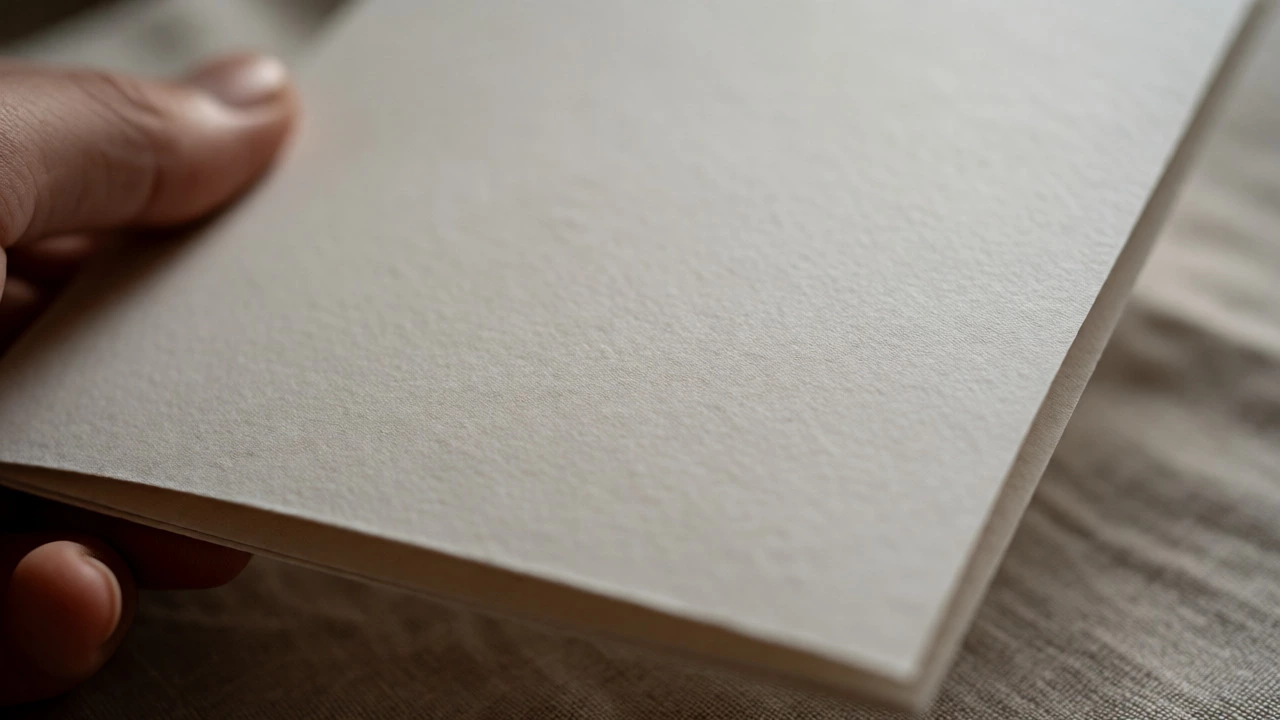
You hand someone a card. They feel the thickness of the stock before they even read your names. That split-second tactile experience is where the perception of luxury begins. It’s not just about what you see; it’s about what you touch. Many couples assume that making an invitation look expensive requires a five-figure budget for custom calligraphy and imported Italian cotton paper. But here’s the truth: expensive-looking invitations are often the result of smart design choices and specific production techniques, not just high price tags.
Think of your invitation as the first physical interaction guests have with your wedding day. If it feels flimsy or looks generic, it sets a casual tone. If it has weight, texture, and depth, it signals care and quality. You don’t need to sell a kidney to achieve this effect. You need to understand the levers that create perceived value. Let’s break down exactly how to trick the eye-and the fingertips-into believing your invite cost three times more than it did.
The Foundation Is Paper Weight and Texture
Start with the base. The most common mistake in budget invitations is using standard office printer paper (20lb bond) or thin cardstock (65lb cover). These feel cheap immediately. To mimic luxury, you need heft. In the printing world, we measure this in pounds (lbs) or grams per square meter (gsm).
For a premium feel, aim for at least 80lb cover stock (approximately 300 gsm). This is the industry standard for business cards and high-end stationery. It doesn’t bend when you hold it by one corner. If you want to go further without breaking the bank, look into duplexing or triplexing. Duplexing means gluing two sheets together to create a thick, solid board. A duplexed sheet can reach 110-120 lb equivalent but costs significantly less than buying a single massive sheet of specialty paper.
- Matte vs. Gloss: Glossy finishes reflect light harshly and can look plastic-y. Matte finishes absorb light, giving a soft, sophisticated look. Always choose matte or uncoated stocks for a modern, expensive vibe.
- Texture Matters: Smooth papers feel clean, but textured papers like linen, laid, or felt add sensory depth. A subtle texture makes the guest pause and run their fingers over the name.
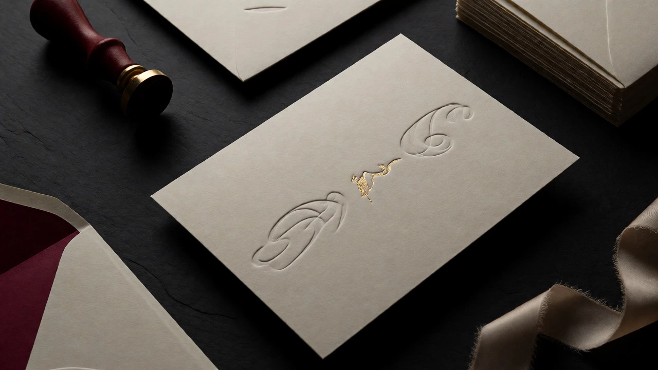
- Color Edge Painting: This is a pro tip. Paint the edges of your thick cardstock with metallic ink or a bold color. It adds a hidden detail that reveals itself when the card is tilted, signaling bespoke craftsmanship.
Printing Techniques That Add Dimension
Once you have the right paper, you need the right way to put ink on it. Flat digital printing is fast and cheap, but it lacks soul. To make an invitation look expensive, you need dimension. You need shadows and highlights created by physical indentation or raised ink.
| Technique | Visual Effect | Tactile Feel | Cost Factor |
|---|---|---|---|
| Letterpress | Deep impression, classic elegance | Sunken text you can feel | High setup, low unit cost if batched |
| Foil Stamping | Metallic shine, reflective surface | Smooth or slightly raised | Medium-High (depends on foil size) |
| Embossing/Debossing | Raised or sunken shapes | 3D texture without ink | Medium (requires die creation) |
| Digital Foil | Metallic accent | Flat or slight raise | Low (no plates needed) |
Letterpress is the gold standard. Historically used for fine art prints, it presses ink deep into the paper fibers. You don’t need full-color letterpress, which is prohibitively expensive. Choose one key element-like the couple’s monogram or the date-and have that printed via letterpress. Keep the rest of the text digital. This hybrid approach gives you the "wow" factor of the impression while keeping costs manageable.
Foil stamping uses heat and pressure to apply metallic film. Real hot-stamp foil creates a mirror-like finish that catches the light. However, avoid covering the entire card in foil; it looks tacky. Use it sparingly. Think small accents: the ampersand between names, a thin border line, or a wax seal emblem. If real foil is too pricey, ask your printer about "digital foil." Modern digital foiling isn’t quite as shiny as hot-stamp, but from ten feet away, no one can tell the difference.
Typography Does the Heavy Lifting
You can have the best paper in the world, but if your font choice screams "Times New Roman," the illusion collapses. Expensive typography relies on contrast and spacing. Cheap designs cram words together. Luxury breathes.
Use a maximum of two fonts. One decorative script or serif for names, and one clean sans-serif or simple serif for details. Never mix two busy scripts. White space is your friend. Leave generous margins around the text. Do not fill every inch of the card. When information is spaced out, it looks curated rather than cluttered.
Kerning (the space between individual letters) should be adjusted manually if possible. Automated kerning often leaves awkward gaps in large display fonts. Tighten the spaces between capital letters in headings for a cohesive block. Also, consider vertical alignment. Center-align everything? It’s safe, but left-aligned text blocks with ragged right edges can look more editorial and modern, akin to high-fashion magazine layouts.
The Envelope Experience
Guests open the envelope before they see the card. Don’t neglect this step. Standard white envelopes are fine, but colored liners transform them. A simple white envelope with a black interior liner instantly doubles its perceived value. You can buy pre-lined envelopes or glue in your own custom paper inserts for pennies.
Addressing matters too. Handwritten addresses on the envelope signal personal attention. If you hate handwriting, hire a calligrapher just for the outer envelopes. Alternatively, use a high-quality address label with elegant typography. Avoid rubber stamps unless they are professionally made and aligned perfectly. Smudged ink looks messy, not rustic.
Consider the closure. Instead of licking a flap, try a belly band. A thin strip of ribbon or paper wrapped around the suite holds it together. It adds another layer of material and allows for a different color pop. Or, use a wax seal. Wax seals are having a major resurgence. You can get custom brass stamps online for under $50. Pressing warm wax onto the envelope adds immediate heirloom quality.
Layering and Suite Composition
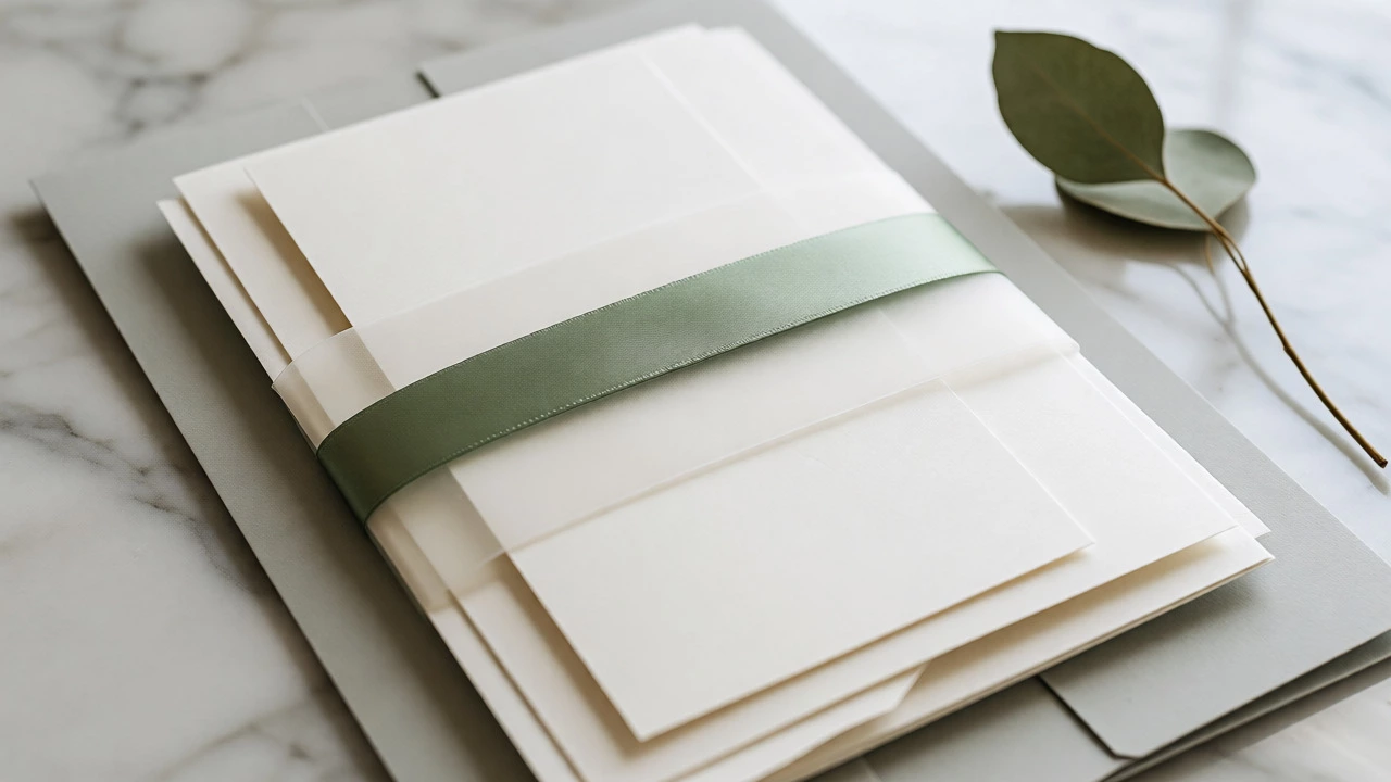
A single card is nice. A suite is impressive. An expensive-looking invitation usually consists of multiple pieces tied together. This is called "layering." Start with a main invitation card. Behind it, place a larger backing card in a complementary color or neutral tone. This creates a visual frame.
- The Backing Card: Should be slightly larger than the invitation (e.g., 1/4 inch larger on all sides). This shows off the edge of the top card.
- Insert Cards: Include separate cards for RSVP details, accommodation info, or a map. Don’t cram these onto the back of the main invite. Separate cards allow for better design focus on each piece.
- Tissue Paper: Wrap the stack in translucent vellum or tissue paper before placing it in the envelope. The sound of crinkling tissue and the reveal of the layers inside builds anticipation.
This assembly process takes time, either for you or your vendor. But the result is a package that feels substantial. When a guest pulls out a multi-layered suite, they perceive effort and expense, regardless of the actual material costs.
Smart Sourcing and Hidden Costs
Where do you find these materials? Big-box stores rarely carry true 300gsm cotton paper. Look for specialty stationery suppliers or local print shops that offer "short runs." Short-run printing services have become incredibly sophisticated. Companies now offer letterpress-style effects and foil on smaller quantities (50-100 units) that were previously only available for bulk orders of 500+.
Beware of hidden fees. Custom dies for embossing can cost $100-$200 upfront. Ask if your printer has existing stock dies for common motifs (florals, geometric shapes). Using a stock die saves hundreds. Also, proofread obsessively. Reprinting a run because of a typo kills your budget. Print one test copy first. Hold it. Tilt it. Read it aloud. Check the spelling of every venue name and date.
Finally, timing is money. Rush fees for expedited shipping and production can add 20-30% to your bill. Order early. Give yourself four weeks for production and mailing. This also allows you to take advantage of sales cycles or seasonal discounts from stationery vendors.
What is the cheapest way to get a foil effect?
Digital foil is the most affordable option. Unlike traditional hot-stamp foil, which requires metal plates, digital foil uses toner-based technology. It works well for small accents like borders or initials. While it lacks the deep shine of hot-stamp, it is durable and visually convincing for most guests.
Is letterpress worth the extra cost?
Yes, if you limit it to one element. Full-page letterpress is very expensive due to plate costs and press time. However, applying letterpress to just the names or a logo creates a focal point. Pair this with digitally printed body text to keep the overall cost reasonable while maintaining a high-end tactile feel.
How thick should my invitation paper be?
Aim for at least 80lb cover (300gsm). Anything thinner feels flimsy. For a truly luxurious feel, consider 100lb cover (350gsm) or duplexed paper (two sheets glued together) reaching 110lb+. Thicker paper resists bending and feels substantial in the hand, which directly correlates to perceived value.
Do I need matching envelopes?
Not necessarily. Matching envelopes are classic, but contrasting colors can look more modern and intentional. Ensure the envelope weight matches the invitation weight so it doesn't tear easily. Adding a colored liner to a neutral envelope is a cost-effective way to elevate the unboxing experience without changing the envelope color entirely.
Can I DIY expensive-looking invites?
Absolutely. Buy heavy cardstock from a craft supplier. Use a home printer with high-quality inkjet settings for the text. Then, visit a local print shop for just the foil or embossing elements, or purchase a handheld embossing tool. Assemble the layers yourself. This splits the labor and material costs, allowing you to control quality while saving on vendor markups.