Colors to avoid for your wedding
Choosing a colour palette can feel overwhelming. Some shades look great on a screen but fall flat in a ceremony. Below we break down the most common colour mistakes and give you practical alternatives that work with bridal veils, gowns and décor.
Why some colours just don’t work
Neon greens or hot pinks may be fun for a party, but they clash with the soft romance most couples want on their big day. Bright neon can distract from the bride, the vows and the emotional moments. Another tricky colour is bright orange – it competes with skin tones and can make lighting tough. Black dresses are possible, yet a full black wedding can feel somber unless you balance it with lighter accents.
Pastel overload is another pitfall. Using five or more pastel shades at once creates a confused look. Guests will have a hard time figuring out which colour belongs to which element. Metallics like gold or silver are beautiful in small doses, but covering every table runner or invitation in glitter can feel cheap rather than elegant.
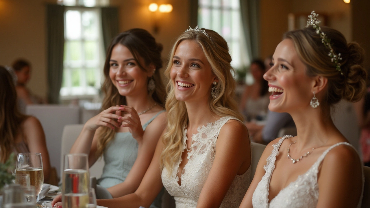
Safer alternatives and how to pair them with veils
Stick to one or two main hues and support them with neutrals. Soft ivory, light blush or muted sage work well with most bridal veils from Cotswold Wedding Veils Boutique. Their veils feature delicate lace and subtle sparkle, so a calm colour background lets the veil shine without competition.
If you love a pop of colour, use it as an accent. Think deep plum table runners, navy ribbons on bouquets or a dusty blue drape behind the altar. These richer tones add depth without overwhelming the scene. Pair them with a classic ivory veil and the contrast feels intentional, not chaotic.
When you decide on a colour, test it in the venue lighting. A colour that looks fresh in daylight may turn muddy under candlelight. Bring a swatch of fabric or a printed invitation to the location and see how it reads at different times of day.
Finally, talk to your veil specialist. The team at Cotswold Wedding Veils Boutique can suggest veil trims, embroidery or appliqués that echo your chosen palette. A subtle beaded edging in gold on a blush veil can tie together a colour scheme that avoids clashing.
In short, skip neon, bright orange and large pastel mixes. Choose one main shade, add a deeper accent, and let your veil be the timeless piece that pulls everything together. With these simple steps you’ll have a colour palette that feels cohesive, elegant and totally you.
Wedding Attire: Colors to Avoid on the Big Day
Choosing the right attire for a wedding involves more than picking a style. Certain colors are traditionally avoided to show respect to the couple and their special day. This article explores which colors are typically not recommended for wedding guests, offering insight and tips for making a suitable choice while still looking fabulous.
Read more