Wedding Color Scheme Ideas & Tips
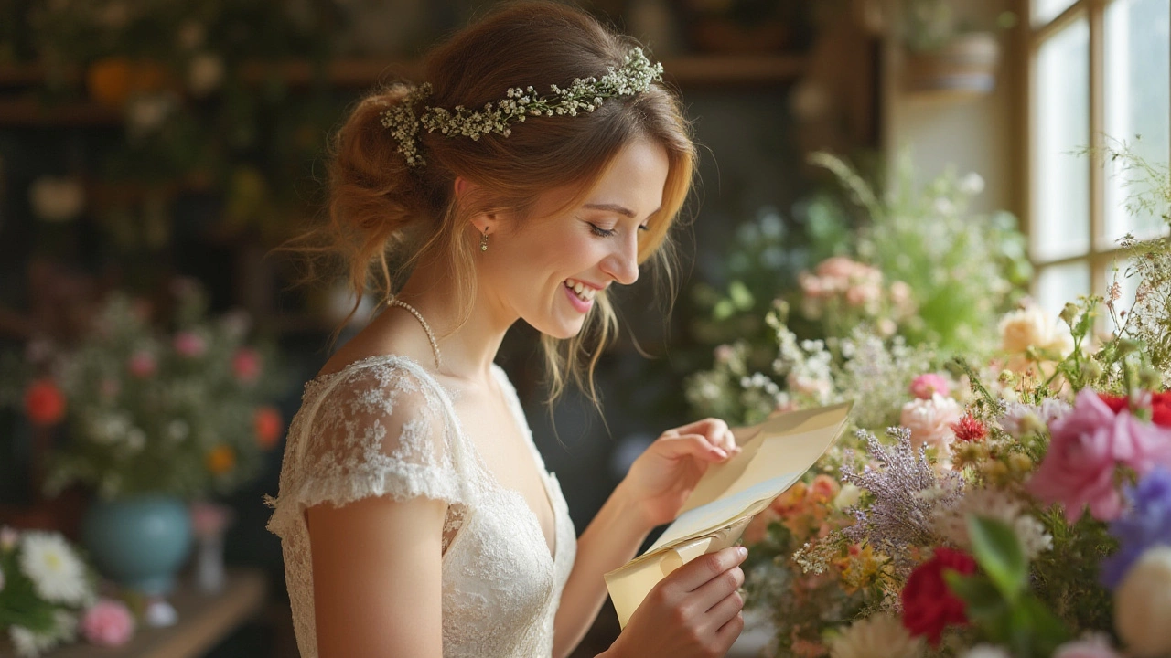
Picking the right colors for your big day is bigger than just liking a shade. The palette ties together your dress, veil, flowers, and even the invitation. When the colors click, the whole wedding feels pulled together and looks great in photos.
Start by thinking about the vibe you want. Do you picture a soft, romantic feel or a vibrant, party‑ready atmosphere? Your answer will steer you toward pastel tones or bold hues. Keep the venue in mind too – a historic barn may suit earthy greens while a sleek city hall works well with crisp black and white.
Classic Color Pairings That Never Fail
Some combos have stood the test of time because they’re easy on the eye and adaptable to many styles. Here are three reliable pairings:
- Blush & Navy: Soft pink adds romance, while navy grounds the look. Use navy for table linens, and blush for flowers and bridesmaid dresses.
- ivory & Gold: Ivory is a safe bridal base and gold brings a touch of luxury. Sprinkle gold in candle holders, cutlery, and veil detailing.
- Grey & Dusty Rose: This mix feels modern yet gentle. Grey suits modern décor, and dusty rose softens the palette in bouquets and ribbon accents.
When you choose a classic scheme, you can play with the intensity of each color. Light shades keep things airy; deeper tones add drama without being over the top.
Bold & Modern Palettes to Stand Out
If you want something fresh, don’t be afraid to mix unexpected shades. Bold palettes work especially well when you have a simple venue that won’t compete for attention.
Emerald & Copper: The rich green pops against copper candleholders or table runners. Pair this with white lilies for a fresh contrast.
Plum & mustard: This combo feels warm and lively. Use plum for the groom’s lounge décor and mustard for napkins or floral accents.
Black & Burgundy: Perfect for an evening wedding. Black tableware creates a sleek backdrop, while burgundy roses add depth and romance.
Bold colors work best when you limit them to two main shades and use neutrals for balance. This prevents the room from feeling chaotic.
Whatever palette you settle on, test it out before the big day. Pull swatches of fabric, look at sample bouquets, and view them under the lighting you’ll have. Seeing the colors together in real life is the only way to know they’ll gel.
Don’t forget the veil. A veil can be a subtle canvas for your color scheme – think a veil trimmed with satin ribbon in your accent hue or a lace veil that picks up a hint of blush. It’s a small detail that ties the whole look together without stealing the spotlight.
Finally, keep your budget in check. Using color in décor (like ribbons, candles, and tableware) is more affordable than changing everything. Focus on the items that have the biggest visual impact – the altar backdrop, the cake frosting, and the bridesmaids’ dresses.
Choosing a wedding color scheme is all about feeling confident with your choices. Start with a vibe, test the shades, and let your favorite pairing guide the rest of the details. You’ll end up with a day that looks cohesive, feels personal, and photographs beautifully.
Best Wedding Flower Colors: How to Pick Your Perfect Palette
Discover how to choose the perfect color for your wedding flowers. Get expert tips, ideas, and facts for building a stunning wedding floral palette.
Read more