Wedding Elegance Estimator
True elegance is about restraint, not budget. Use this tool to assess how well your current decor plans align with the principles of a "classy" wedding.
Your Wedding Elegance Profile
Visual Palette Preview:
Analysis & Recommendations
You walk into a reception hall. The lights are dimmed just right. There is no blinding sparkle, no chaotic mix of ten different fonts on the signage, and definitely no giant inflatable flamingo blocking the dance floor. Instead, everything feels calm, intentional, and expensive without screaming for attention. That feeling? That is classy. It is not about having the biggest budget; it is about restraint.
Many couples think "classy" means boring or old-fashioned. They worry that if they don't add enough glitter, guests will think the event was cheap. But true elegance is actually harder to pull off than a maximalist party because every flaw is visible when there is nothing hiding in the background. If you are planning your big day, you want to know exactly what separates a standard setup from one that feels refined. Let's break down the specific elements that create that sophisticated vibe, focusing heavily on how you style your space.
The Power of Negative Space
Here is a hard truth: clutter kills class. When you try to fill every square inch of a venue with flowers, candles, and props, you create visual noise. Your eyes don't know where to rest. A classy wedding relies on negative space-the empty areas around objects-to let key details breathe.
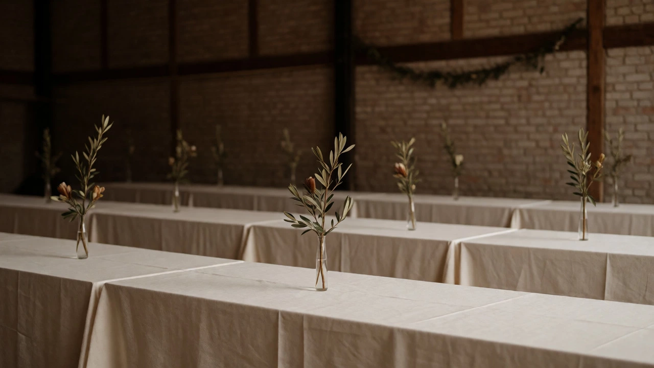
Think about a museum exhibit. You don't see all the paintings stacked on top of each other. They are spaced out so you can appreciate each one. Do the same with your tables. Instead of running a thick runner across the entire table, use small, individual centerpieces. Leave the linen visible. This shows confidence in your choice of fabric and tableware. If you have beautiful chairs, don't cover them with sashes unless necessary. Let the material speak for itself.
In Sydney, we often deal with venues that already have strong architectural features-brick walls, timber beams, or harbor views. A classy approach respects these existing structures rather than trying to mask them completely. Use the architecture as part of your decor. A simple garland draped along a beam looks far more intentional than trying to hide the beam behind a wall of balloons.
Color Palettes That Age Well
Trends come and go faster than you can order your invitations. Last year it was dusty blue; this year it might be sage green. If you build your entire aesthetic around a trendy color, your photos will look dated in five years. Classy weddings tend to stick to neutral bases or classic combinations that have stood the test of time.
Consider a palette rooted in nature. Whites, creams, taupes, soft grays, and deep greens are safe bets because they reflect natural light beautifully. If you want a pop of color, keep it monochromatic or limited to two complementary tones. For example, pairing ivory with burgundy works because both colors share a warm undertone. Mixing bright orange with pastel pink can feel jarring unless executed by a professional stylist who understands color theory.
| Palette Type | Perception | Risk Factor | Best For |
|---|---|---|---|
| Monochromatic Neutrals | Sophisticated, Timeless | Can feel sterile if textures vary poorly | Formal evening receptions |
| Jewel Tones (Emerald, Navy) | Luxurious, Rich | Can look heavy in daylight | Winter or indoor venues |
| Pastel Mixes | Soft, Romantic | Often appears washed out in photos | Garden daytime ceremonies |
| High Contrast Brights | Festive, Energetic | Can appear casual or childish | Beach or poolside parties |
Texture Over Sparkle
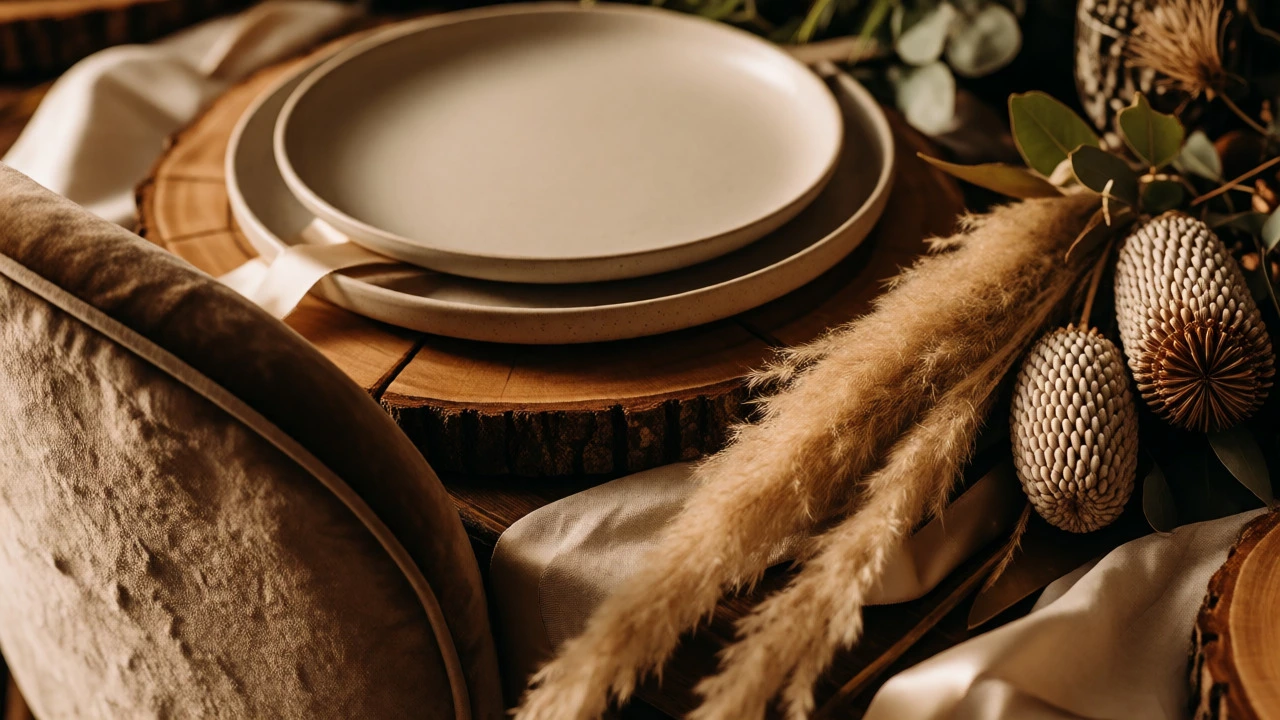
This is the secret weapon of high-end event design. If you want your wedding to look expensive, stop buying plastic confetti and start investing in texture. Sparkle is cheap; texture is tactile and interesting. When guests run their hands over a velvet chair, touch a linen napkin, or brush against dried pampas grass, they engage their sense of touch. This sensory experience creates a memory of quality.
Mix materials intentionally. Pair smooth glass vases with rough-hewn wood chargers. Combine sleek satin ribbons with matte ceramic plates. The contrast between shiny and matte, or hard and soft, adds depth to the visual field. In our local context, using native Australian textures like eucalyptus leaves or banksia pods adds an authentic, grounded feel that generic imported roses simply cannot match. It tells a story about where you are, which is inherently more personal and refined than a generic "fairytale" theme.
Lighting Sets the Mood
You can have the most expensive flowers in the world, but if your lighting is wrong, the room will feel flat. Bad lighting makes everyone look tired and drains the color from your decor. Good lighting flatters faces and highlights the best parts of your setup.
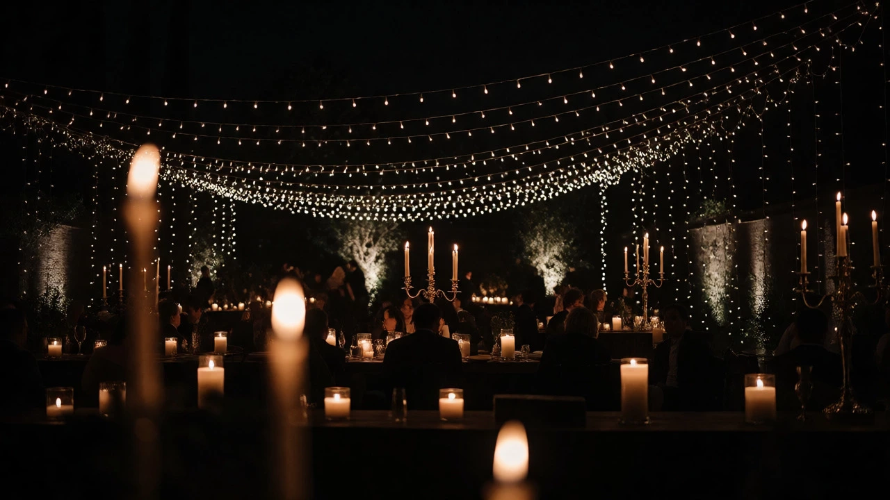
Avoid harsh overhead fluorescent lights at all costs. Most venues allow you to dim the main lights. Turn them down. Then, layer in lower-level light sources. Candles are the gold standard here. Real beeswax candles burn cleaner and brighter than paraffin, and they don't leave a waxy residue on your furniture. Place candles at varying heights. Tall candelabras draw the eye up, while low votives create intimacy at table level.
If you are outdoors, string lights should be warm white, never cool blue-white. Cool lighting feels clinical, like a hospital waiting room. Warm lighting feels like a dinner party at a friend's house who has great taste. Up-lighting the walls or trees can also add drama without adding physical clutter to the floor.
Typography and Signage
Nothing ruins a classy vibe faster than a handwritten sign done in three different colored markers. Or worse, a digital font printed on glossy paper that reflects the flash of every camera. Typography is a huge part of branding your event, and it needs consistency.
Pick one or two fonts max. A serif font (like Times New Roman or Garamond) reads as traditional and formal. A clean sans-serif (like Helvetica or Montserrat) reads as modern and minimalist. Don't mix them randomly. If your invitation uses a script font, use that same script for your place cards and menu headers. Keep the text minimal. You don't need to write "Welcome to the Wedding of John and Jane" on a massive board. Just "John + Jane" is enough. We know why we are there.
Material matters too. Acrylic signs with laser-cut letters look sharp and modern. Chalkboards can work if written by a professional calligrapher, but amateur chalk writing looks messy. Wood slices are rustic, not necessarily classy, unless styled very carefully. Choose materials that complement your venue's vibe.
Floral Arrangements: Less Is More
Over-flowered tables are a common mistake. Couples often think more flowers equal more luxury. Actually, tight, dense arrangements can look stuffy and block conversation. Classy floral design is airy and structural.
Focus on stem length variation. A single tall branch of olive or magnolia in a slim vase looks more dramatic than a round ball of mixed blooms. Use seasonal flowers. In Australia, importing peonies out of season drives up costs and reduces freshness. Using locally grown ranunculus, anemones, or native foliage ensures the flowers look vibrant and last longer through the night. Also, consider the scent. Strongly scented lilies can overwhelm food aromas. Opt for unscented or lightly scented blooms near dining areas so the focus remains on the meal and conversation.
Attire and Grooming Details
While this article focuses on decor, your attire contributes to the overall aesthetic. A classy wedding requires cohesive grooming. Ill-fitting suits or dresses with excessive embellishments can clash with a minimalist decor theme. If your dress is simple, let the jewelry shine. If your suit is classic navy or charcoal, avoid loud pocket squares.
Pay attention to the details that guests see up close. Clean shoes, polished buttons, and neat hairlines matter. These micro-details signal care and respect for the occasion. When the bride and groom look put-together, it validates the effort put into the rest of the event. It sets a standard that says, "We took this seriously," which encourages guests to do the same.
Music and Atmosphere Control
Class isn't just visual; it's auditory. Blasting top-40 hits at maximum volume during dinner is a surefire way to kill sophistication. During the meal, music should be background ambiance. Jazz, classical, or acoustic covers work well. Volume should allow guests to talk without raising their voices.
Save the high-energy playlist for the dance floor later. Transitions matter too. A DJ or band that smoothly fades songs rather than cutting abruptly maintains the flow. Announcements should be brief and clear. Avoid long, rambling speeches. Keep toasts under three minutes. Respect for guests' time is a hallmark of a well-run, classy event.
Common Pitfalls to Avoid
Even with good intentions, it is easy to slip into tackiness. Here are a few traps to watch out for:
- Matching Everything: You do not need matching bridesmaid dresses, matching ties, and matching flower girls. Coordinated is better than matched. Slight variations in shade or style look organic and chic.
- Excessive Theming: Unless you are doing a costume party, avoid literal themes. No pirate hats, no cowboy boots at a black-tie event. Subtle nods to your interests are fine; full-on cosplay is not.
- Ignoring Comfort: If guests are uncomfortable-too hot, no seats, bad acoustics-they perceive the event as less refined. Luxury includes comfort. Ensure temperature control and adequate seating.
- Digital Clutter: Hashtag signs are optional. If you use one, make it subtle. Giant neon hashtags distract from the elegance of the space.
Final Thoughts on Execution
Creating a classy wedding is about editing. Start with a vision, then remove anything that doesn't serve it. Ask yourself: Does this item add value? Is it functional? Does it fit the mood? If the answer is no, cut it. Simplicity allows your personality and your relationship to take center stage, rather than competing with your decor.
Remember, class is subjective, but consistency is universal. When your colors, textures, lighting, and typography all agree with each other, the result feels harmonious. And harmony is the foundation of elegance.
Is a classy wedding always expensive?
No. Class comes from intentionality, not price tags. You can achieve an elegant look with thrifted vintage linens, DIY calligraphy, and seasonal local flowers. What costs money is poor planning and last-minute fixes. Spending wisely on lighting and table settings yields higher returns than buying expensive but mismatched decor.
How many colors should I use in my wedding decor?
Stick to two or three primary colors plus neutrals. Too many colors create visual chaos. For example, choose one dominant color (like navy), one accent (like gold), and one neutral (like white). This limits confusion and ensures a cohesive look across invitations, flowers, and attire.
Are fresh flowers necessary for a classy wedding?
Not strictly. High-quality silk flowers can look realistic if chosen carefully. However, fresh flowers offer unique textures and scents that synthetics lack. If budget is tight, prioritize fresh flowers for the bouquet and head table, and use high-quality faux options for distant centerpieces. Never use cheap plastic-looking fake flowers.
What is the biggest mistake people make with wedding lighting?
Relying solely on the venue's overhead lighting. Overhead lights cast unflattering shadows and wash out colors. Always bring in secondary light sources like candles, string lights, or lamps. Dimming the main lights is the easiest way to instantly upgrade the atmosphere from "conference room" to "intimate gathering."
Does minimalist mean boring?
No. Minimalism focuses on quality and detail. A minimalist wedding might have fewer items, but each item is chosen for its beauty and function. Texture plays a huge role here. Velvet, linen, wood, and stone add interest without visual clutter. Boring happens when things are plain and unconsidered, not when they are simple and curated.