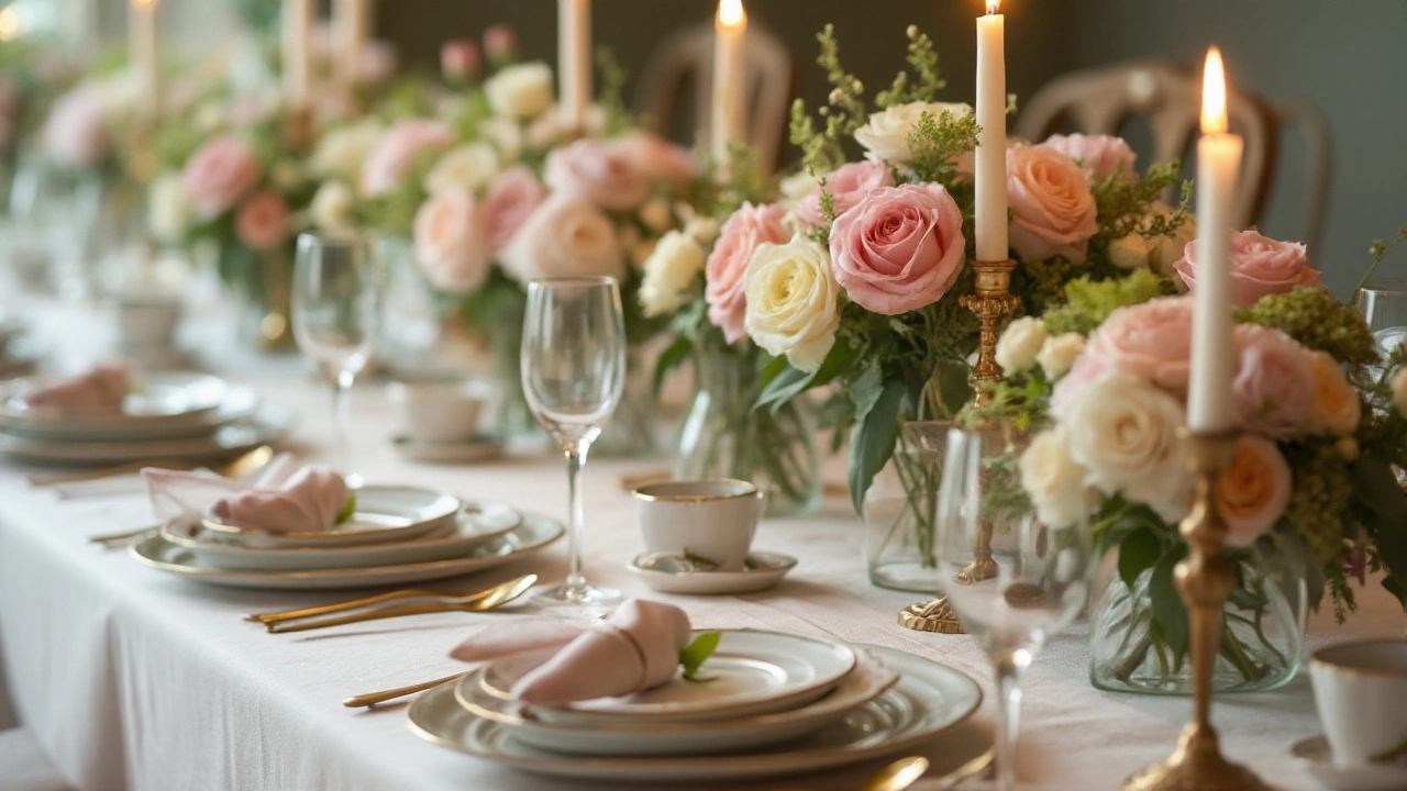
Color Palette: Easy Tips for Choosing Your Wedding Colors
Picking a color palette can feel overwhelming, but it doesn’t have to be. Start with one or two shades you love – maybe the blush of a spring garden or the deep navy of a twilight sky. From there you can build out secondary tones that complement without clashing. This approach keeps things simple, saves time, and makes every detail of your day look intentional.
Choosing Your Wedding Colors
First, think about the venue. A stone barn often looks great with soft neutrals and muted greens, while a modern loft shines with bold contrasts like black and gold. Next, consider the season. Spring favors pastel pinks, lilacs, and light greys; summer welcomes bright corals, teal, and sunny yellows; autumn leans into burnt orange, burgundy, and forest green; winter feels luxurious with icy blues, deep purples, and silver.
Once you have a base, add an accent color for pop. A splash of rose gold in your table runners, or a few teal napkins, can tie everything together. Keep the total palette to three or four hues – more than that can look chaotic. Use a color wheel app or swipe through Pinterest boards to see which combinations feel right.
How Veils Fit Into Your Palette
Veils are often overlooked, but they’re a perfect place to echo your chosen colors. A classic ivory veil works with any scheme, but you can also opt for blush‑tinted tulle, soft gold lace, or even a subtle dust‑blue overlay. If your palette includes a bold accent, consider a veil with a thin ribbon or embroidered edge in that exact shade – it’s a tiny detail that makes a big impact.
When you shop with us at Cotswold Wedding Veils Boutique, we’ll help you match the veil to your dress and colour plan. Bring photos of your décor or swatches of fabric, and we’ll suggest the perfect veil material – be it sheer lace, organza, or beaded tulle. The right veil not only complements your dress but also pulls the entire colour story together.
Don’t forget accessories. Boutonnieres, groomsmen ties, and even cake frosting can adopt your accent hue, reinforcing the palette from every angle. Consistency creates a cohesive feel without looking forced.
Finally, test your palette in real life. Order sample fabrics, view swatches under the lighting you’ll have on the day, and see how they appear next to each other. What looks great on a screen can change under warm candlelight or bright daylight.
With a clear base hue, one or two accent colors, and thoughtful veil choices, your wedding will feel beautifully coordinated. Keep the process fun, trust your instincts, and remember that the most memorable weddings are the ones that reflect the couple’s true style.
Choosing Wedding Decoration Colors to Make Your Day Unforgettable
Selecting the perfect color palette for your wedding decorations can make a significant impact on the look and feel of your big day. With an endless array of hues to choose from, it might feel overwhelming. This article guides you through popular wedding color choices, considering seasonal trends and personal styles, and provides practical tips to create a beautiful and cohesive theme.
Read more