Invitation Colors: Choose a Palette That Ties Your Wedding Together
When you start picking invitation colors, you’re actually setting the tone for the whole day. The right shades can link your dress, veil, flowers and even the cake. If the colors feel off, guests might notice a mismatch before they even walk through the door.
First, think about the feeling you want. Soft pastels give a romantic vibe, bold jewel tones scream drama, and classic whites or creams keep things timeless. Look at the venue – a stone barn often looks amazing with warm earth tones, while a garden wedding loves fresh greens and blush pinks.
Match Your Veil and Dress
At Cotswold Wedding Veils Boutique we see how a veil can pull a palette together. If you have a ivory veil with delicate lace, pairing ivory or cream invitations creates a seamless flow. On the other hand, a dusty blue veil works beautifully with navy or soft grey invites. Choose one dominant color from your veil or dress and let that guide the invitation shade.
Don’t forget the little details. If your veil has a hint of silver thread, a subtle metallic accent on the envelope or foil stamping can echo that sparkle without overwhelming the design.
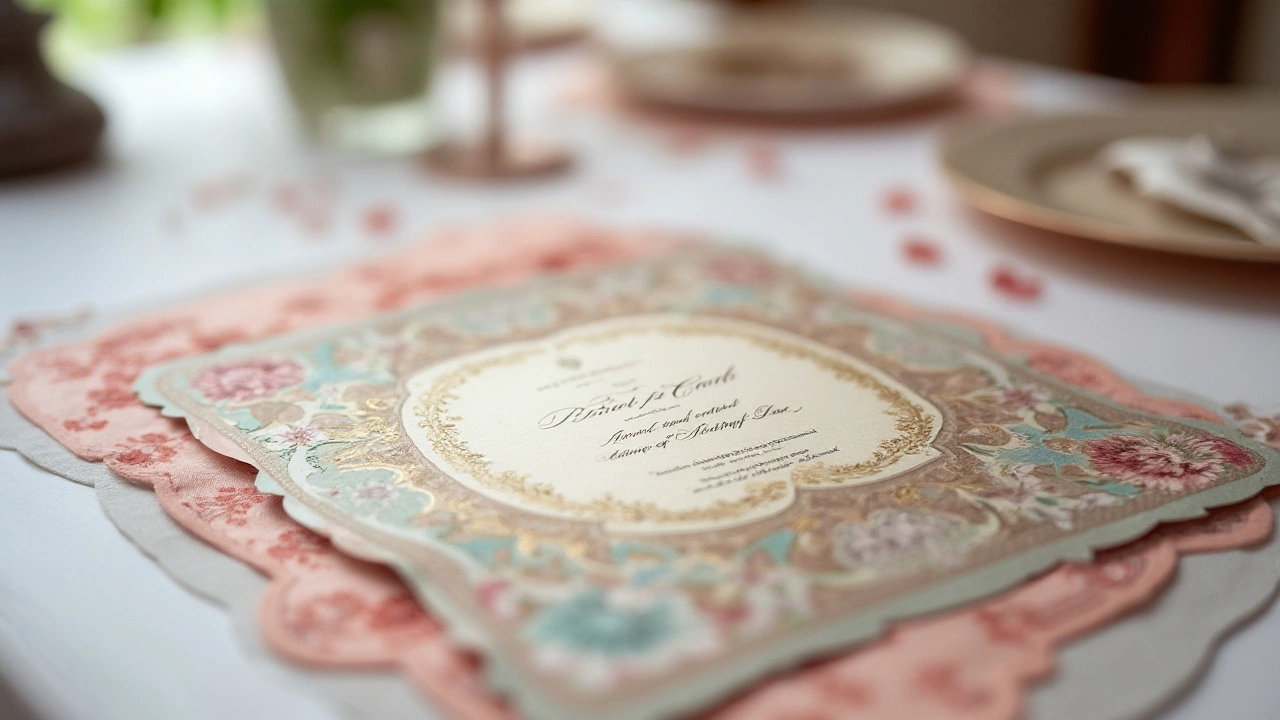
Use the 60-30-10 Rule
Design experts swear by the 60-30-10 rule: 60% of your palette is a dominant color, 30% is a secondary shade, and 10% is an accent. For invitations, you might use ivory for the main paper (60%), soft lavender for the printed text (30%), and a gold foiled border as the accent (10%). This balance keeps the look cohesive but still interesting.
Apply the same rule to other parts of the wedding – bridesmaids’ dresses, table linens, and even the cake décor. When everything follows the same formula, the day feels pulled together.
Practical tip: create a mood board. Cut out fabric swatches, press a few veil pieces, and place them next to sample invitation cards. Seeing everything side by side helps you spot clashing tones before you order a bulk print.
If you’re still stuck, start with the season. Spring weddings thrive on mint, peach, and lilac. Summer loves coral, turquoise and bright yellow. Autumn brings rust, olive and deep burgundy. Winter works with icy blues, silver and rich plum. Align your invitation colors with the season and you’ll automatically get a harmonious look.
Finally, think about readability. Dark text on a light background is easier for guests to read, especially older relatives. If you love a dark invitation, use a light font or add a contrasting border. This small tweak keeps the design gorgeous and functional.
Choosing invitation colors doesn’t have to be stressful. Start with the veil, apply the 60‑30‑10 rule, and let the season guide you. In a few minutes you’ll have a palette that feels just right and ties every detail of your wedding together.
Choosing the Perfect Color for Wedding Invitations: A Guide
Selecting the right color for wedding invitations is crucial as it sets the tone and theme of the entire event. The color choice should reflect the couple's personality and the overall ambiance they wish to create. This guide explores traditional and modern color options, the symbolic meanings behind various hues, and essential tips for matching invitations with wedding themes. Dive into the art of choosing colors that not only look beautiful but also convey the story of your special day.
Read more