Wedding Colors: Choose the Perfect Palette for Your Big Day
Picking wedding colors feels like a big decision, but it doesn’t have to be stressful. The right hues tie together your dress, flowers, and venue, making everything look pulled together. Think of color as the glue that holds the look of your ceremony and reception.
Why Color Matters
Colors affect the mood of the day. Soft pastels feel romantic, while bold jewel tones add drama. Your venue’s lighting also plays a role – a rustic barn will look different in ivory than a chic city loft. When you understand how light changes shades, you can avoid a palette that clashes with the space.
Tips for Picking Your Palette
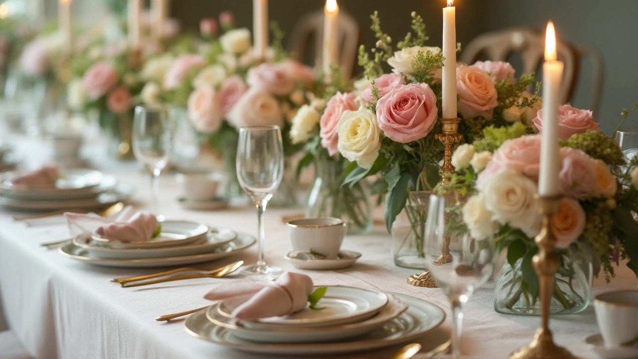
Start with one thing you love, like the color of your dress or a favorite flower. If you’re wearing a white gown, you have flexibility to add any accent color. Look at season‑specific hues: spring leans toward blush and sage, summer loves bright corals, autumn favors burnt orange and deep greens, and winter welcomes icy blues and rich burgundy.
Next, bring together three main colors: a primary shade, a secondary supporting tone, and a neutral for balance. For example, navy (primary), dusty rose (secondary), and ivory (neutral) work well for a classic look. Keep the list short so it’s easy to repeat across décor, ribbons, and table settings.
Don’t forget the little details. Veils, shoes, and jewelry can echo a pop of color, tying your look to the overall theme without overwhelming the senses. Our boutique veils, for instance, come in soft ivory, blush, and even subtle silver tones that match many palettes.
Finally, test your choices. Pull swatches of fabric, look at flower samples, and view photos of similar settings. Seeing the colors side by side helps you spot any clashing tones before you commit.
By following these steps, you’ll create a wedding color palette that feels personal and cohesive. The result? A day that looks exactly how you imagined – beautiful, balanced, and uniquely yours.
Choosing Wedding Decoration Colors to Make Your Day Unforgettable
Selecting the perfect color palette for your wedding decorations can make a significant impact on the look and feel of your big day. With an endless array of hues to choose from, it might feel overwhelming. This article guides you through popular wedding color choices, considering seasonal trends and personal styles, and provides practical tips to create a beautiful and cohesive theme.
Read more